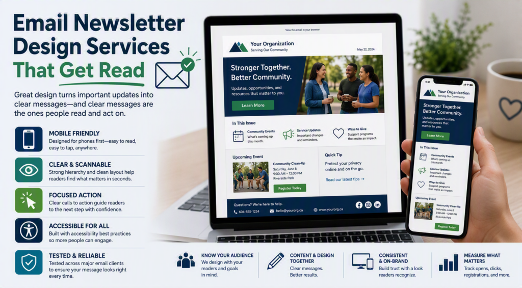
A newsletter can be well written, sent on time, and still disappear in a crowded inbox. When the layout is difficult to scan on a phone, the call to action is buried, or the email looks different from the organization readers recognize, even valuable updates can go unread. Email newsletter design services help solve that practical problem by turning information into emails people can understand quickly and act on with confidence.
For a professional office, nonprofit, clinic, or local business, an e-newsletter is more than a marketing task. It may carry service updates, community news, event information, policy reminders, fundraising messages, or timely advice for clients. The design needs to make every message feel clear, credible, and easy to use.
What good newsletter design actually does
Good email design is not decoration added after the content is finished. It gives the message an order. A reader should be able to open the email, understand who it is from, identify the main point, and find the next step within a few seconds.
That means using familiar brand colors and type choices, but it also means making practical decisions about hierarchy. The most important story belongs near the top. Headings need to be distinct without overwhelming the page. Buttons should look like buttons. Images should support the message rather than create extra loading time or push essential details out of view.
For organizations with varied audiences, clarity matters even more. A healthcare provider may need to communicate appointment information carefully. A community organization may need to make an event registration deadline obvious. A legal or professional services office may want to share useful guidance without turning an email into a dense article. Design makes these different priorities easier for readers to navigate.
Email newsletter design services start with your audience
The best design approach depends on what your readers expect and what you need them to do. A monthly community update should not look or behave exactly like a fundraising campaign or a security advisory to business clients.
Before a template is built, it helps to answer a few business questions. Who receives the newsletter? What information do they value most? Are they likely to read on a mobile phone? Is the goal to encourage registrations, generate calls, share updates, or simply maintain a regular connection? These answers guide the structure far better than copying a generic email template.
A service-focused business may benefit from a simple format with one featured topic, a short practical tip, and a clear contact option. A nonprofit may need room for volunteer opportunities, donor impact, and upcoming programs. An organization with frequent notices may need a modular system that allows staff to add or remove sections without breaking the visual structure.
The goal is consistency without making every issue feel identical. Readers should recognize the sender immediately, while still having a reason to open the next email.
The design details that affect results
A polished newsletter is built from many small decisions. Some are visual, and some are technical, but all affect whether an email performs reliably.
Mobile reading comes first
Most people check email from a phone at least part of the time. A design that looks excellent on a wide desktop monitor can become frustrating when viewed on a small screen. Text may shrink, columns may stack awkwardly, and buttons may become hard to tap.
A mobile-friendly newsletter uses a single-column layout where possible, readable font sizes, generous spacing, and buttons large enough for a finger. Important details should appear as live text, not be embedded inside an image. If an image fails to load, the message still needs to make sense.
A clear visual path
Readers rarely consume newsletters word for word. They scan. Effective layouts use a clear path: a recognizable header, a main message, supporting content, and a focused next step. This approach respects a reader’s time and reduces the risk that the key information is missed.
Too many competing calls to action can weaken an email. If every section asks readers to register, donate, call, download, follow, and learn more, they may choose none of them. It is usually better to decide what matters most for that issue and give it the strongest visual emphasis.
Accessible content supports more readers
Accessible design is good service. It helps people using screen readers, people with low vision, and readers who may be viewing an email in poor lighting or on an older device. High color contrast, descriptive image text, plain-language headings, and logical reading order all make a difference.
Accessibility also improves everyday usability. A vague button labeled “Click Here” gives readers little context. A button labeled “Register for the June workshop” is clearer for everyone.
Reliable rendering and testing
Email software is not as predictable as a website browser. Outlook, Gmail, Apple Mail, and mobile devices can display the same email differently. A design must be tested before it goes to an entire list, especially if it includes multiple columns, complex graphics, or customized buttons.
This is where professional support can prevent avoidable problems. Testing helps catch broken links, cropped images, unreadable text, missing preview text, and formatting issues before they become a public-facing mistake.
Content and design need to work together
Even an attractive newsletter cannot rescue a message that is unfocused. At the same time, strong content can be overlooked if the presentation is cluttered. The best results come when planning, writing, and design happen together.
Start each issue with one central purpose. Perhaps readers need to know about a new service, a deadline, a planned office closure, or an upcoming community event. Lead with that message. Supporting items can follow, but they should not compete for attention.
Keep paragraphs short and use descriptive headings. When a topic needs more detail than an email can reasonably hold, provide a concise overview and a single clear route to continue the conversation. A newsletter should invite action, not force readers to search for it.
Subject lines and preview text also deserve attention. They set expectations before the email is opened. A subject line that is overly clever can be less effective than one that plainly explains the benefit or update. For a trusted local organization, clarity often builds more confidence than hype.
Choosing a service model that fits your organization
Email newsletter design services can range from a one-time template project to ongoing support. The right choice depends on your staff capacity, sending frequency, and how much your content changes from month to month.
A reusable template is often a good fit for organizations with an internal staff member who can write and schedule emails but needs a professional, dependable framework. It creates consistency and can reduce the time required to prepare each issue. However, the template should be easy for your team to update. A beautiful design that requires technical skills every month may create a new bottleneck.
Ongoing newsletter support is useful when staff are already stretched or when emails need regular design, editing, scheduling, and reporting. This model can also help organizations maintain a consistent communication schedule rather than sending updates only when time permits.
There is a trade-off. A simpler template may be faster and more affordable to maintain, while a highly customized design can create a stronger campaign experience for a major announcement or event. Not every email needs the same level of production. Matching the effort to the purpose keeps communication practical and sustainable.
Questions to ask before starting
A capable design partner should ask about more than colors and logos. They should want to understand your audience, email platform, approval process, privacy responsibilities, and reporting needs. They should also explain choices in straightforward terms, particularly if your team does not work in marketing or design every day.
Ask how the design will perform on mobile devices, whether it will be tested across common email applications, and how future updates will be handled. Confirm who owns the final template and whether your staff will receive guidance for using it. If analytics matter, decide which measures are meaningful for your goals. Open rates can offer a general signal, but clicks, registrations, inquiries, donations, or event attendance may tell a more useful story.
For organizations that rely on trust, the final email should feel like an extension of the service experience. It should be accurate, respectful of reader time, and easy to respond to.
Myriad Technologies helps Fraser Valley organizations bring their technology and communications work together, from dependable IT support to practical e-newsletter development. A well-designed newsletter is one small but valuable part of staying connected with the people who count on your organization. When it is clear, accessible, and reliable, every send becomes another opportunity to show readers that their time and attention are valued.