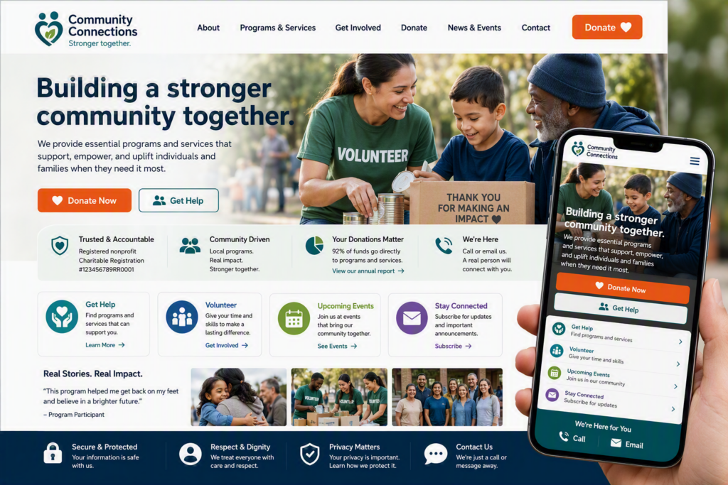
A potential donor hears about your organization, searches your name on their phone, and lands on a page that takes too long to load or makes the next step unclear. That moment can cost more than a donation. It can leave someone unsure whether your organization is active, trustworthy, or equipped to help. Website design for nonprofits is not primarily about making a site look polished. It is about giving people confidence to act.
For community organizations, a website often serves several jobs at once. It introduces the mission, helps people find programs, accepts donations, recruits volunteers, shares urgent updates, and gives staff a place to direct questions. The best approach is practical: make the information people need easy to find, keep private data protected, and give your team a site they can manage without calling a developer for every small update.
Start With the Actions Your Community Needs
Before choosing colors, photography, or a page layout, identify the few actions that matter most. A food bank may need visitors to find pickup times. A youth program may need parents to register. A community service agency may need people to request confidential support. A foundation may need donors to give online and understand where their money goes.
Those needs should guide the site structure. If donations are essential, a clear Donate button should be visible in the main navigation and near stories that demonstrate impact. If services are the priority, visitors should be able to reach eligibility details, hours, locations, and contact options within a click or two.
Trying to give every page equal importance usually creates confusion. A nonprofit website should respectfully lead people toward the next useful step. That might be donating, registering, calling, subscribing, or finding help. The right next step depends on the organization, but it should never be a mystery to the visitor.
Keep the Navigation Short and Familiar
A long menu can feel comprehensive to staff because it reflects how the organization is structured internally. Visitors do not think in departments, committees, or funding categories. They think, “Can you help me?” or “How can I help?”
For many organizations, a simple top-level navigation can cover the essentials: About, Programs or Services, Get Involved, Donate, News or Events, and Contact. More detailed information can sit beneath those sections. The point is not to force every nonprofit into the same menu. It is to use plain labels that a first-time visitor understands immediately.
Build Trust Before You Ask for Support
People give their time, money, and personal information when they believe an organization is legitimate, capable, and accountable. Your website should answer the natural questions behind that decision: Who are you? Who do you serve? What happens with donations? How can someone reach a real person?
Specificity builds more trust than broad claims. Rather than saying your organization “changes lives,” explain what a program does, where it operates, who can access it, and what a recent contribution made possible. Short stories from participants, volunteers, or community partners can help when shared with consent and appropriate privacy protections.
Make the basics easy to find as well. A current phone number, monitored email address, physical location when relevant, leadership information, charitable registration details, annual reports, and privacy information all signal that the organization is open and accountable. Not every visitor will read these pages, but their presence matters.
Photography deserves careful thought. Authentic photos of your team, volunteers, facilities, and community activities usually carry more credibility than generic stock images. Still, permission and dignity come first. Organizations serving vulnerable people may need to avoid identifiable photos or use images that protect client privacy. Trust is strengthened when the website reflects that care.
Make Information Accessible to More People
Accessibility is not an extra feature for a small group of users. It affects parents reading on a phone, older donors increasing text size, volunteers using a keyboard, and people who rely on screen readers or captions. It also makes the site clearer for everyone.
Good website design for nonprofits uses readable font sizes, strong color contrast, descriptive headings, and clear button labels. A button that says “Learn More” can be acceptable when the surrounding context is obvious, but “View Volunteer Opportunities” is more helpful. Images that communicate meaningful information need alternative text so screen-reader users can understand their purpose.
Videos should include captions. Forms need clear labels and useful error messages. A visitor should not have to guess why a form failed or which field needs attention. If your website includes downloadable documents, consider whether the information would be easier to read on a web page. Many PDFs are difficult to use on mobile devices and can create accessibility barriers if they are not prepared properly.
Accessibility work can feel technical, but the principle is simple: do not make people work harder than necessary to access your organization’s help or participate in its mission.
Treat Donations and Forms as Sensitive Systems
Donation pages, volunteer applications, intake forms, and newsletter signups are not just website features. They collect information that deserves the same care as the rest of your organization’s technology.
Use trusted payment tools and make sure the site has a current security certificate, so visitors see a secure connection in their browser. Collect only the information you genuinely need. A volunteer interest form may not need extensive personal details at the first step. A service intake form may require more care, especially if it involves health, financial, family, or other sensitive information.
There is a trade-off between convenience and control. A free form tool may be easy to launch, but it may not offer the privacy settings, data location options, user permissions, or support your organization needs. Likewise, a donation platform should be evaluated for fees, donor experience, reporting, integration with your records, and how well it works on a mobile device.
Staff access matters too. Former employees and volunteers should not retain administrator access after their role ends. Use separate accounts rather than shared passwords, enable multi-factor authentication, and keep a simple record of who can update the website, donation platform, domain registration, and email accounts. A website problem can quickly become an operational problem when no one knows who holds the credentials.
Design for the Staff Who Will Maintain It
A beautiful website becomes a burden if only one outside person can update it. Nonprofits need a realistic maintenance plan, especially when programs, events, staff, and funding information change frequently.
Choose a content system that fits your team’s comfort level. The most flexible option is not always the best option. If a site requires advanced technical knowledge for routine edits, updates may be delayed and visitors may encounter outdated information. A well-planned site uses reusable page sections and straightforward editing tools so authorized staff can publish a news item, change office hours, or add an event without disrupting the layout.
That does not mean staff should be left alone with the technical side. Software updates, backups, security monitoring, spam protection, and recovery planning are ongoing responsibilities. A nonprofit may need a different level of support depending on its size, budget, sensitivity of data, and reliance on online services. The important thing is to decide who is responsible before an urgent issue occurs.
At Myriad Technologies, we often see that organizations benefit when their website, email, security, and day-to-day IT support are considered together. The public-facing site may be only one part of the operation, but it depends on dependable accounts, secure access, and people who can respond when something goes wrong.
Measure What Helps You Serve Better
Website reporting should answer useful questions, not create a pile of numbers. Look at whether visitors complete donation forms, register for programs, contact your team, or find the pages they need. If many people leave a page quickly, that does not automatically mean the page failed. They may have found an address or phone number immediately. Context matters.
Review the site after a campaign, event, or program change. Ask front-line staff what questions people still call about. If the same questions keep coming in, the website may need clearer answers. Keep an eye on broken links, old event listings, expired forms, and outdated staff information. Small maintenance tasks protect credibility.
A nonprofit website does not need every new feature to be effective. It needs to be clear, current, secure, and welcoming to the people who depend on it. Start with one real visitor journey – a donor ready to give, a family seeking support, or a volunteer looking for a way in – and make that path easier this month.